OPPO Find 5 Review
by Vivek Gowri on May 29, 2013 6:55 AM EST- Posted in
- Smartphones
- Qualcomm
- Mobile
- APQ8064
- OPPO Find 5
Obviously, battery life is a huge concern for any high-end Android phone. We’ve been at the point where handsets have to be charged daily unless you’re willing to turn off a lot of things - my father has been running his Galaxy S3 on EDGE just to squeeze two days of runtime out of it and while that’s an extreme case, that’s just where phones are right now. The main difference seems to be that sometimes, you end up with phones that don’t actually get a full day out of the battery. The OPPO is one of those phones.
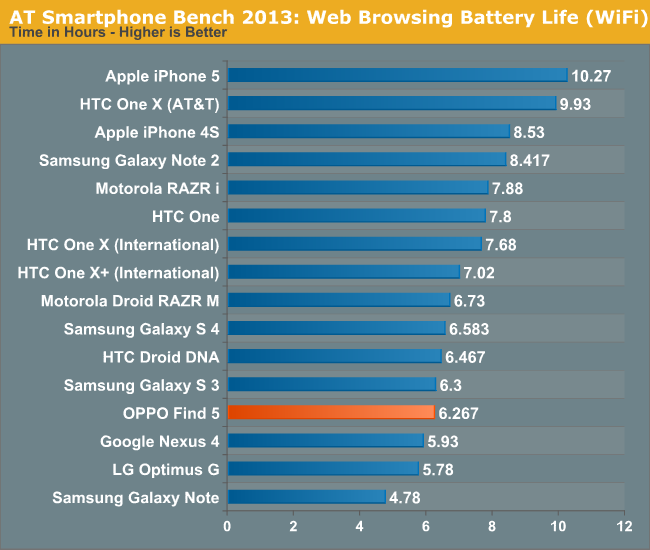
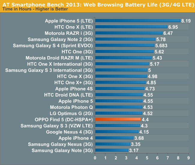
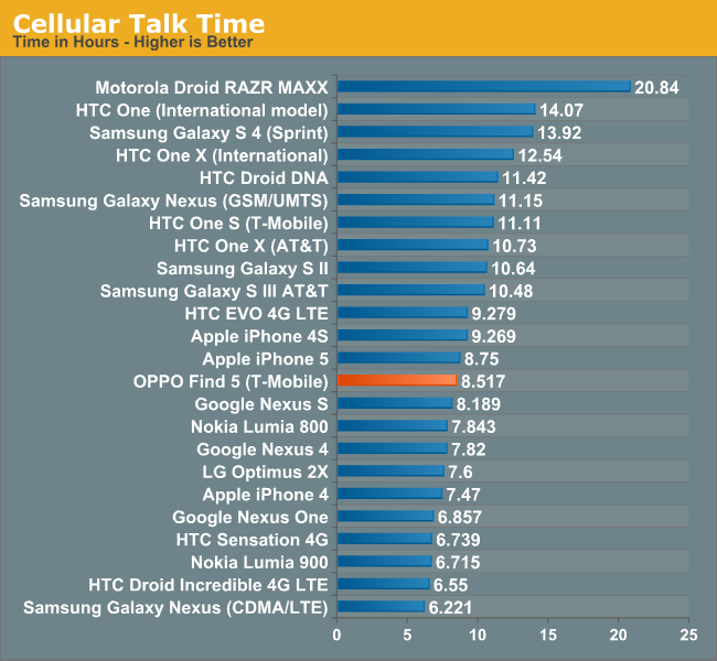
The Find 5 has a 2500 mAh li-poly battery that has a nominal voltage of 3.8V, giving it a 9.5 watt-hour capacity. That’s pretty much what we’re seeing in high-end handsets these days, slotting in right between the 9.88Wh SGS4 and the 8.74Wh HTC One. Runtime slots in between the Nexus 4 and the Droid DNA, nearly exactly where the Galaxy S3 was and not far off the S4, but well behind the comparatively stellar battery life of the One.


That’s not too bad, but it’s important to note that the battery life has improved significantly with newer firmware revisions. My first battery life tests with the Find 5 were in the 3.5-4 hour range, numbers that I honestly didn’t even think were possible. My first reaction was that I had set up the test wrong or that the phone had shut off partway through the test with battery still remaining. Subsequent revisions have improved that, and the ~6 hours of battery life we’re seeing now is much more in line with what I had originally expected. In the process, I had the Find 5 die on me during the day more often than almost any phone that I can remember. It’s more reasonable now, but battery life still isn’t something I would call good. Tolerable, more like.
OPPO ships the Find 5 with a 5V, 1A charger that’s pretty small for a device with a battery this large. It takes 5:31 to charge fully, and I really think that the output of OEM charging bricks needs to increase to match the near-doubling in battery capacity over the last three years. I’ve been charging my phones with more powerful tablet power bricks for as long as I can remember, because that’s the only way to get reasonable charging times with the devices that have 10Wh of battery capacity onboard.


39 Comments
View All Comments
Kristian Vättö - Wednesday, May 29, 2013 - link
I agree with you on the button layout. Power button on the side design might be okay if you're right-handed as your thumb can easily reach the button but I can say from experience that it's awful if you're left-handed (like me). Given the size of the current phones, it's very, very hard to securely reach the power button with your left index finger - but I'd have no problems if the button was placed on the top of the device.That said, I know left-handed people are the minority and most designs ignore us, but I'm pretty sure there are scenarios when right-handed people use their phone with their left hand. Or at least I use my Nexus 4 with my right hand by time to time (e.g. while driving).
kondamin - Wednesday, May 29, 2013 - link
Powerbutton on the top of the device or the bottom is the way to do it. I'm constanly chaning the volume when I turn my s3 off because of that moronic idea of putting them on oposing sides.And you are spot on that these devices aren't friendly for left handed people, the biggest sinner in my book is nokia their lumia buttons are all on the same (and wrong) side.
JPForums - Wednesday, May 29, 2013 - link
I'm mostly ambidextrous, but I'm always using my Lumia 920 with my left hand. I have no trouble using it with my right either (just switch to operating the buttons with my thumb), but I find more often than not, I pick it up and operate it with my left hand. On that note, I suspect I'd get used to the OPPO button placement fairly quickly as well (even if it isn't ideal). I'm guessing you don't much care for operating your phone buttons with your fingers. I do agree with you that putting the power and volume rocker on opposite sides is a generically bad idea, though.mr_tawan - Wednesday, May 29, 2013 - link
I'm kinda like the Galaxy Nexus's button layout. In the other hand, button layout on the Nexus 7 sucks. I constantly press volume button instead of power button.I think the power button on the top is good for smaller phone. For a larger phone (>4.6"), it's should be on either left or right side, and on the opposite side of volume buttons). It's too far to reach the top.
WhiteAdam - Wednesday, May 29, 2013 - link
Love my job, since I've been bringing in $82h… I sit at home, music playing while I work in front of my new iMac that I got now that I'm making it online. (Home more information)http://goo.gl/fDMVb
nancy919 - Wednesday, May 29, 2013 - link
it's realy the easiest work Ive had.mwarner1 - Wednesday, May 29, 2013 - link
I actually prefer having buttons on the side of modern, large screened phones. The idea of having the power button on top is fine for a device the size of an iPhone, but when you are taking about devices with 5+ inch displays, it is rather awkward to reach all the way to the top of the device to press the power button.Zandros - Wednesday, May 29, 2013 - link
As a right-handed person, I'm usually holding my phone with my left hand so my dominant hand is free to do other things (which occasionally consists of stabbing at the screen).Maybe I'm missing something, though, but isn't having the power button on the left site (as in this case) advantageous for thumb use if you're using it with your left hand?
Kristian Vättö - Wednesday, May 29, 2013 - link
Oh, you're right - the power button is on the left side in the OPPO. I just looked at the "Finger Friendly Design" picture and thought that it's on the right side like in my Nexus, haha. At least for me, it would advantageous to have the power button on the left instead.Basically, with the OPPO all the right-handed people go through the same pain as I go through with the Nexus 4.
VivekGowri - Wednesday, May 29, 2013 - link
Yeah the OPPO power button is a nightmare. I am not impressed by their so-called finger friendly design.