LG Google TV Review
by Jason Inofuentes on October 2, 2012 9:00 PM EST- Posted in
- Google TV
- Media Streamer
- Media Player
- LG
- Honeycomb
- Android
- LG L9
- LG G2
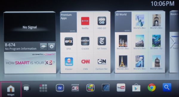
LG has a line of Smart TVs that exists in parallel to their Google TV efforts, and it has its own distinctive UI. It’s this UI that LG brought to, and set atop, Google TV. So, where Google TV is full of bright colors set atop a black background, the silver/grey motif of LG is a bit distinct. The arrangement of icons is also distinct from Google TV.
LG’s UI is a triptych of panels with either content or grids of icons. The left most panel is topped by the current content, and below that an ad for the device itself (this seems odd but I imagine it will eventually host affiliate advertising). The next panel is for Premium Apps; these are generally among the better and certainly more recognizable app options on Google TV. The panel is arranged as a 3x3 grid, with the top left-most location devoted to the panel title that can be selected to reveal additional Premium Apps.
The third panel is for LG’s 3D World, a collection of curated and streamed 3D content. Clicking on an icon there will send you to a website that actually hosts and presents the content. Some of this content is somewhat novel, but if it disappeared you wouldn’t miss it. A second screen full of panels is to the right of these, though 3D World shows up in each. The other two panels are Bookmarks, which of course open to their respective links in Chrome, and Frequently Used Apps which is a rotating set of apps based on your usage. This is far handier than the 3D World panel, but there’s no apparent way to change the panel order.
Along the bottom is a dock full of icons, including, oddly, a Home button. The idea is that this should be persistently accessible, but I only ever see it when I hit the Home button. A notification alerts you to app activity, and next to that an App Drawer gets you access to all the apps available. Live TV comes next, alongside another link to 3D World. TV & Movies follows and is an elegant aggregator of content available online and through your cable provider. Selecting a piece of content will lead you to the appropriate app or website, or, if you have the IR blaster configured to control your set-top box or DVR, tune to that content or schedule a recording. Next is the Spotlight Gallery, an occasionally redundant feature that brings together various web apps for content partners that don't have Android specific apps. The requisite YouTube app comes next, followed by the Play Store, Chrome, and a Search button.
Within all versions of Android there has been a persistent battle to decide what the best paradigm for accessing certain functions should be. Eliminating hardware buttons has been a crusade of Google’s for sometime, but the result is redundancy. Here we have a Search button on a Home screen in a use paradigm that includes a Search button on the controller that will be used to access that Home screen. So, yeah, the battle continues.
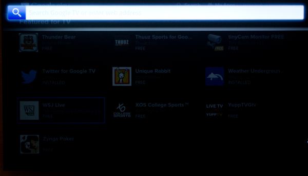
Let’s talk about Search for a minute. When we talk about Google Search on the web we’re talking about searching for web content. When we talk about Google Search on your phone we’re talking about searching for Contacts, Apps, and web content. When we talk about Google Search on your TV we’re talking about video content, and this is where Google has its greatest success.
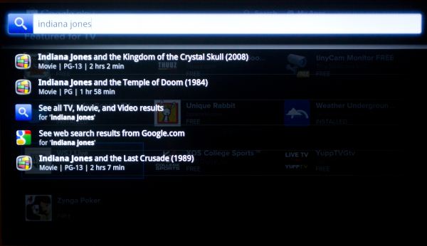
A simple search for ‘Indiana Jones’ will take you to listings for various Indiana Jones films through the TV & Movies app. There are two things to note here, though. First, we’re not looking at the actual links to the apps with the content. So if one of the movies is available through Amazon Instant Video, we don’t see that. Instead we are sent to Google’s aggregator, TV & Movies, one more step than necessary. The other thing to notice is that the full breadth of Google’s search skills are not at work here. Absent from the listed Indiana Jones movies is Raiders of the Lost Ark, the first of the Indiana Jones films. Lacking the name Indiana Jones in the title makes this unexpected, if it weren’t for the fact that we know Google Search is more capable than that. The same search on the web gives us two Wikipedia topics, the actual website for the franchise, and IMDB links to the most recent Jones film, and the first, Raiders, in that order.
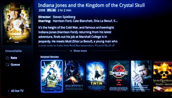
Now let’s chase down one of those links. Under Indiana Jones and the Kingdom of the Crystal Skull, we find a description of the film, its cast, the box art, and a disturbingly huge section devoted to telling us more about related content. But look to the left under the box art: Unavailable. If this movie was available for Rental or Purchase in one of the associated content partners it would offer the option to Rent or View the content. In this case, it shows nothing. Why wouldn’t this be acknowledged in the Search results? Look back at that section for related content; each of those films is available for rent or purchase. If the search results hadn’t brought us to this mostly useless page, we wouldn’t know that while we can’t watch the content we searched for, we can watch one of the Transformers sequels.
The Magic Wand
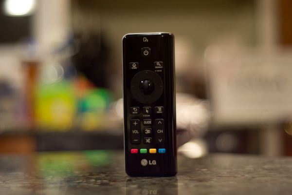
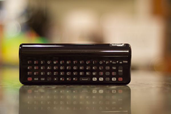
All the icons and panels are nothing without a way to access them. Logitech’s solution was one of their fine media-centric wireless keyboards. Sony’s solution was like the awkward offspring of a QWERTY keyboard and a Playstation controller. Both were effective if a little bulky. LG’s solution is called the “Magic Wand” remote; and the experience is not dissimilar to using a Wiimote with a QWERTY keyboard strapped on its back side. An on-screen cursor follows your movements with the wand, and a scroll wheel and directional pad compliment the experience, along with volume and channel buttons, and assorted other function keys. Flip the remote over and you have a keyboard replete with a number pad, playback controls and directional keys.
As elegant a solution as it seems, the execution isn’t quite up to scrutinization. The motion control isn’t 1:1 and accuracy is affected by speed of motion, so accuracy depends on adjusting to the sensor’s characteristics. But if your target is particularly small, say pressing a link on a website, pressing the selection key often causes enough movement to throw your aim off. A Wii Plus style improvement in tracking accuracy would allay many of these issues, and decreasing the pressure needed to depress the selection key would seal the deal.
The keyboard isn’t without its issues either. They keys themselves are small but perfectly pressured rubber nubs with a very satisfying click on activation. Unfortunately, the arrangement of the keys leaves me a bit perplexed. The far left side is dominated by the number pad, with letter keys in between and some directionals and other keys to the right. Along the bottom are other assorted keys including the Fn, Shift, Ctrl and playback control keys, and then the Android specific Search, Back and Menu keys.
The first concern is that none of these keys are backlit, and in a high end media device, lacking a backlight on your keys is damning indeed. Second, a few traditional media keys (Input, PIP toggle, Information, power switches for external devices) are absent on the main side and fall in as alternate functions on the number pad. Their proximity to the Fn key makes it awkward to squeeze your thumbs into the small space and depress them together. If there were gestures that replaced these functions (Input control, in particular) then this might be a non-issue. Instead, switching from one input to another involves either contorting your thumbs or returning to the Home screen and pressing one of the smaller on screen buttons.
All told, this isn’t a bad way to control a television with a rich graphical UI, but LG's utter devotion to this approach is a conceit too far. Waving the wand to bring up the cursor and running it over to the appropriate button to do something as simple as pausing playback simply isn’t more efficient than hitting the pause button. As a first effort, there’s room for improvement, for sure. But then, that’s true of all the television UIs we’ve encountered.






50 Comments
View All Comments
tipoo - Tuesday, October 2, 2012 - link
Glad to see a TV review here, a lot of more regular TV review sites skip the objective hard numbers. I'm curious though, sRGB was a standard set for computers, was it not? Does it make a good test for TVs, since they were never the target? Is there no separate standard for them?cheinonen - Wednesday, October 3, 2012 - link
sRGB and HDTV (Rec. 709) have the exact same primaries and white point. The only difference really is that video uses a smaller range of values (16-235) than RGB (0-255) for video, but it should hit the same color points. sRGB also has a gamma standard while HDTV does not, but HDTV and sRGB are very, very close to each other.gavincredible - Monday, April 13, 2015 - link
Great post. For those who live outside US like me, you can access Netflix, Hulu and similar media stations on your Google TV by using UnoTelly or similar tools.dagamer34 - Tuesday, October 2, 2012 - link
I feel like unlike with smartphones, it's not a technology problem, it's a business problem, and those are a lot harder to fix. We all know how it SHOULD work. It SHOULD be just like Netflix, but with live, recent television. A show has a "live" broadcast with ads at a certain time, then as soon as the show is over, you can watch it on demand on the same service. You should be able to pick up any device to continue watching right at the same point. We should be getting fewer, far more relevant ads because you can do REAL ad targeting based on who is watching, not what they are watch and do away with this fake Nielson crap. I care about TV shows, not TV channels. I should be able to bring up the IMDB info of an episode as it's happening to find actors, writers, directors, etc... all in real time.I want the TV of the future I was promised, not the crap they currently peddle to us now.
J_Tarasovic - Tuesday, October 2, 2012 - link
Ahem!!! The Ceton Q looked promising but it was announced that it was put on hold today. Too bad.ssj3gohan - Wednesday, October 3, 2012 - link
And this is why the TV in its current, and past, form has never appealed to me. As soon as I got to (our country's equivalent to) college, I haven't really watched TV anymore. You can get the experience you're describing on a PC. I've been able to do that for the last 10ish years.hulawafu77 - Wednesday, October 3, 2012 - link
Wow, you are truly a hardcore TV watcher. Reading that, almost made me think there was a new profession, TV watching that I was unaware of.ol1bit - Tuesday, October 2, 2012 - link
I have the Sony Google Tv box, and overall I'd say Goggle TV gets a FAIL.Using Google Tv, all I get for choices seems to be Netflix or Amazon. It is no where close to MS media center! It can't see or connect to my Silicon Dust dual tuner, can't connect with any media server I have. Can't record shows, can't seem to stream video from the web other than Netflix, amazon, or youtube(yuck). Aka, media center has lots of plug-ins.
Xbox, XMBC, Plex, MS Media center are better. Sure it has android, but you can't download very much for it.
I use it for Netflix and Blu-ray, that's it.
Don't get me wrong I have Android phones, Asus Transformer Prime, and they are wonderful.
Google seems like they have no, zip, zero ideas what to do for a media device!
mr_tawan - Wednesday, October 3, 2012 - link
I have Sony Google TV, and I don't use those NetFlix or Amazon.I mainly use it for Youtube, a lot of clips don't play properly on the box. Next thing I uses is aVia media player for network player (uPNP and some online service) and local media player. And the other thing I use a lot is Slacker Radio, eventhough I'd prefer TuneIn, it's not available.
I don't really understand why Google choose not to include Music or Video player from the Android into these Google TV. Without these we are drived to 3rd-party app, which is not really many given that GoogleTV does not support NDK (yeah I have to blame those developer for not porting the app entirely to Android).
Google Play is still need to catchup on what on the Android. Currently it provides only app just like Android's one a few years ago.
JasonInofuentes - Wednesday, October 3, 2012 - link
TuneIn is available as a web app. You can find it by heading to the Spotlight app. It's a pretty solid web app, though i would prefer the native app. Cheers.Jason