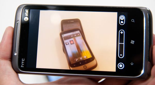
If you read our launch piece, you’ve probably already heard and and seen much of what I’m going to talk about regarding the Surround’s camera. That said, things have been fleshed out a bit since the launch piece.
First off, the Surround packs a 5 megapixel camera with LED flash. Photos are 2592 x 1944 on the Surround and average around 4.5 MB between 700 kilobytes and 1.6 MB (update: mistake on my part), which translates to a lot of compression. Interestingly enough, the WP7 camera interface on the HTC Surround only lets you change shooting resolution (from VGA to 5 MP in 1 MP steps), not how much photos are compressed. The camera again can be launched either by holding the camera button for 4 seconds with the device off, by pressing the button while it is on, or by launching it from the applications list. Launch is pretty speedy averaging almost exactly 2 seconds from tap to live preview.

When I put the photos in our smartphone camera bench gallery, I accidentally missed one - the very last one. When I settled on the locations for our camera bench, I didn’t realize that the one at the very end would actually be the most useful. It features a wide range of colors, varying spatial frequencies (small and large objects on various backgrounds), and best of all, controlled lighting. Anyhow, that photo is now in the gallery and below:
Likewise, there are photos from the Surround in our more controlled lightbox tests with the lights on and off:
The photo taken with the Surround in the dark does have a noticeably blue cast which is a bit strange, and illumination isn’t as even as some of the dual LED flash phones. That said, exposure in the center is dead on even in the darkness.
Unfortunately, WP7 (at least on the Surround) neglects to illuminate the scene with the LED flash while running the autofocus routine with the shutter button pressed halfway down. The result is that shooting photos in darkness or near darkness results in missed focus a lot of the time. The capture flash in darkness is double - one dim followed closely by one bright, so it’s obviously pre-illuminating the scene with the flash for the sake of metering, and then capturing, but focus is somehow left out.
This is admittedly something that a ton of smartphone vendors are getting wrong in their products, but I’d like WP7 to get it right. If there’s an LED flash onboard that can be left on continually without overheating, use it to illuminate the scene during autofocus, tap to focus, or whenever showing a preview in pitch darkness. Just do it. Otherwise it’s virtually impossible to compose the scene or know if you’re at focus. For devices with a Xenon flash, obviously this isn’t possible, but it’d be nice to see continual illumination leveraged in a useful manner whenever possible.
In good illumination, the Surround’s camera isn’t much better than HTC’s other cameras I’ve tested thus far. Specifically, there’s a ton of extra sharpness that is being added, which is very apparent when viewing almost any of the images 1:1. The level of sharpness rivals (if not exceeds) the HTC Incredible.
But what’s strange about the Surround is that its focal plane is very curved. Check out this photo of the ground taken completely normal to it.
Note how field dependent focus is. It’s clear there’s some very field dependent aberrations (most dominantly, field curvature) contributing to a strong increase in softness at the edges. The Surround is the first device I’ve noticed with so much field curvature that I felt it was worth noting, but I’m going to start rigorously testing more smartphone cameras for it. Overall, I’m not super impressed with the Surround’s camera. It’s totally fine for casual throwaway shots, but still reminds me a lot of the Nexus One’s all around mediocre performance. You can compare for yourself and see in the galleries.


39 Comments
View All Comments
KayDat - Saturday, November 13, 2010 - link
Would have been interesting if HTC could implement a keyboard/speaker combo. Slide one way for speaker, other way for keyboard. That way, you wouldn't add thickness just for speakers.bpt8056 - Saturday, November 13, 2010 - link
I like your idea about the speaker/keyboard combo. In addition to that, better landscape support would make this phone a much more competing product.vol7ron - Sunday, November 14, 2010 - link
I love the fact that speakers/sound quality are now being considered by manufacturers. I wish the kickstand was on it, so the screen was higher.I'm curious how big the speakers are - I also would not be too sure that the part would be durable enough to withstand a slide out keyboard/speaker combo.
Randomblame - Saturday, November 13, 2010 - link
if only it ran windows mobile 6.5 and that slide out was a keyboard. That would be the updated rhodium aka touch pro 3 I would buy.Snotling - Saturday, November 13, 2010 - link
come on now... win mobile? What else Windows XP forever? Do you Miss Pentium CPUs? Still playing Starcraft 1?aebiv - Monday, November 15, 2010 - link
No, some of us aren't wow'd by the fact with WP7 you LOSE functionality vs WM6.5.Quit being a tool.
Nataku - Monday, November 15, 2010 - link
well... legacy is a blessing and a curse, thats all that can be said for winmo6.5...im actually glad win phone 7 gets a fresh start, at least nothing to drag it's feet
a12e - Saturday, November 13, 2010 - link
only has 8 GB of integrated NAND, I believe, not 16.softdrinkviking - Saturday, November 13, 2010 - link
i can't find that mistake. on pg 2, it says 512MB of integrated NAND, and a 16GB microSD card.a12e - Saturday, November 13, 2010 - link
In the spec comparison table at the bottom of the first page for the Samsung Focus.I wish it had 16GB... then I'd have an extra 8GB right now. :)