The iOS 10 Review: Refining the iOS Experience Both Over & Under the Hood
by Brandon Chester on September 13, 2016 12:00 PM EST
The momentum of the mobile space has changed in the past year. As the market for high end smartphones approaches saturation, the focus on the software side has moved from massive feature expansions to refinement and optimization. We saw great examples of this with both iOS and Android over 2014 and 2015. Whereas iOS 8 and Android Lollipop were heavy with feature releases, iOS 9 and Android Marshmallow were much lighter. Following up to a large feature release provided both teams a good time to reflect upon their development directions and a focus on improving the user experience.
2016 marks a very special year for iOS. After launching as iPhone OS back in 2007, iOS has gone through many iterations and a name change, and has now arrived at version 10. Although version numbers are somewhat arbitrary – Apple has been on macOS 10 for sixteen years now – the tenth major release for an operating system is still an important and exciting milestone. It means that a platform has withstood the test of time, and ideally has had ample opportunity to mature. At the same time however, because it’s a milestone, it’s a reflection on both the past and the future; what has come before, and what is yet to come. For Apple and its eager customer base, iOS 10 embodies this well: the company is in a position where they need to deliver a substantial update, if for no other reason than to satisfy expectations.
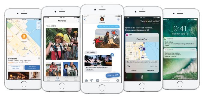
With iOS 10 it's difficult to describe what Apple has focused on. It's really one of those OS releases that makes changes to every part of the system. There are big design changes, and big app changes, plus new features and APIs so developers can make even better applications. On top of all that there are performance improvements to bring back the smoothness to areas where it was lost during Apple's rapid redesign and feature boosts in iOS 7 and 8.
With feature-rich releases it can often be difficult to decide where to start the discussion. To keep in line with my previous iOS reviews I'll start off with a look at what changes Apple has made to the iOS UI before moving on to feature changes at the app level and then finishing with changes at the developer level. Without any further delay, lets dive into the new refined design of iOS 10.


113 Comments
View All Comments
sonicmerlin - Wednesday, September 14, 2016 - link
Really? Hiccups and frame drops make a powerful phone look weak. Smoothness adds to the sensation of fluidity of user experience. Aesthetics are a constant stimuli while using something as personal as a cell phone.tipoo - Wednesday, September 14, 2016 - link
We [probably] live in the first world, what else are we supposed to have?And nor does first world mean developed world.
https://en.wikipedia.org/wiki/First_World
Ranger1065 - Thursday, September 15, 2016 - link
The fact that you feel the need to differentiate between the terms "first world" and "developed world" is symptomatic of a first world mindset, as is quoting Wikipedia as an authority.If people are seriously concerned about " a tiny bit of judder while scrolling in safari,"
count yourselves lucky you don't have any real problems.
I don't live in the first world and I don't give a damn about political correctness or terminological exactitude, when all it amounts to is splitting hairs....just for the record :)
star-affinity - Wednesday, September 21, 2016 - link
I would't say I'm "seriously concerned" about those things, but when you're talking about a device that's beeing used extensively I absolutely think it's worth discussing user experience.Of course a lot of thing seems rediculous when looked at "the grand scale of things", but I still don't thing one thing has to exclude the other. It's always difficult to compare your own life to the rest of humanity, because there will probably always be someone who has a worse situation in life than you. So does that mean we shouldn't strive for quality and a good experience when using smartphones? I think not.
robinthakur - Friday, September 23, 2016 - link
If you don't live in the "first world" perhaps you'd feel more at home at an Android site ;)tipoo - Saturday, September 16, 2017 - link
Or you could look up any other source you wanted with the information at your fingertips and find I'm right about the definition. First world just meant US and it's allies, second meant the USSR and it's allies, and third world meant unaligned. Not anything about riches or poverty.robinthakur - Friday, September 23, 2016 - link
I agree, it got so bad on my iPhone 6 plus about a month ago, that I got judder scrolling from one home screen to the next, so in a fury I went and bought an S7 Edge to play with until the iPhone 7 was released. It's actually very very smooth overall and if it integrated into the rest of my kit and Apple services (Apart from Apple Music) then I might consider using it. Overall, the tight design language throughout the hardware and the operating syMornistem and polished first party features made me order the iPhone 7.iPhone used to be the smoothest scroller and was a major factor in me staying on iPhone before iOS8 because I can't stand frame rate drops (I like my games 60+fps too) so this is also a big deal for the 7/iOS10 and how they choose to optimize in the future. The phone should never feel 'slow' in normal day to day operation using OOTB features...
lilmoe - Tuesday, September 13, 2016 - link
Also, take a look at those improved Javascript benchmarks, seems like iOS10 came with a CPU upgrade too!/s
Meteor2 - Tuesday, September 13, 2016 - link
Now I know Anandtech won't do a day-of-release view of the iPhone 7, but when can we expect to see a review?JoshHo - Tuesday, September 13, 2016 - link
When it's done.